

An early project of Soluri Architecture, Sensident: Prevention & Beauty was the first office for Dr. Jimenez. After deciding to begin his own practice, Dr. Jimenez sought to establish a chain of comprehensive dental-spas offering cutting-edge dental and beauty care with the latest technology at a reasonable cost.
Leading the industry curve of dental care in a spa-like experience, Dr. Jimenez desired to create a serene yet striking facility that would help reinvent the image and experience of a traditional dental clinic. His goal was to achieve a cutting-edge facility with a minimal budget, using innovative design to create a striking yet tranquil experience for clients.
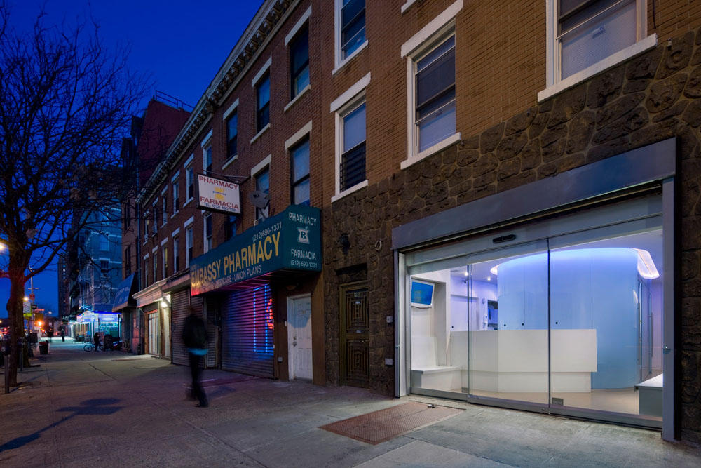
One of the primary goals for this first office was to establish the Sensident brand and build a patient base. As a young doctor setting out on his own, Dr. Jimenez had no patients at the onset of the project. His strategy was to create such a striking design for the office, that it would attract the attention of pedestrians walking by who might then decide to try their services. To achieve this, the doctor chose not to hire a traditional design firm that specialized in medical or dental offices, because he did not want the office to look like a traditional dental or medical office.
To keep costs down and maximize his potential patient base, Dr Jimenez had selected a 633 square-foot storefront space in an underprivileged community, designated a “Health Professional Shortage Area” with just one dentist per 40,000 residents.
Because of this small space, our design team had to think “outside the box” to achieve the goals of creating a striking, state-of-the-art dental facility at a low cost.
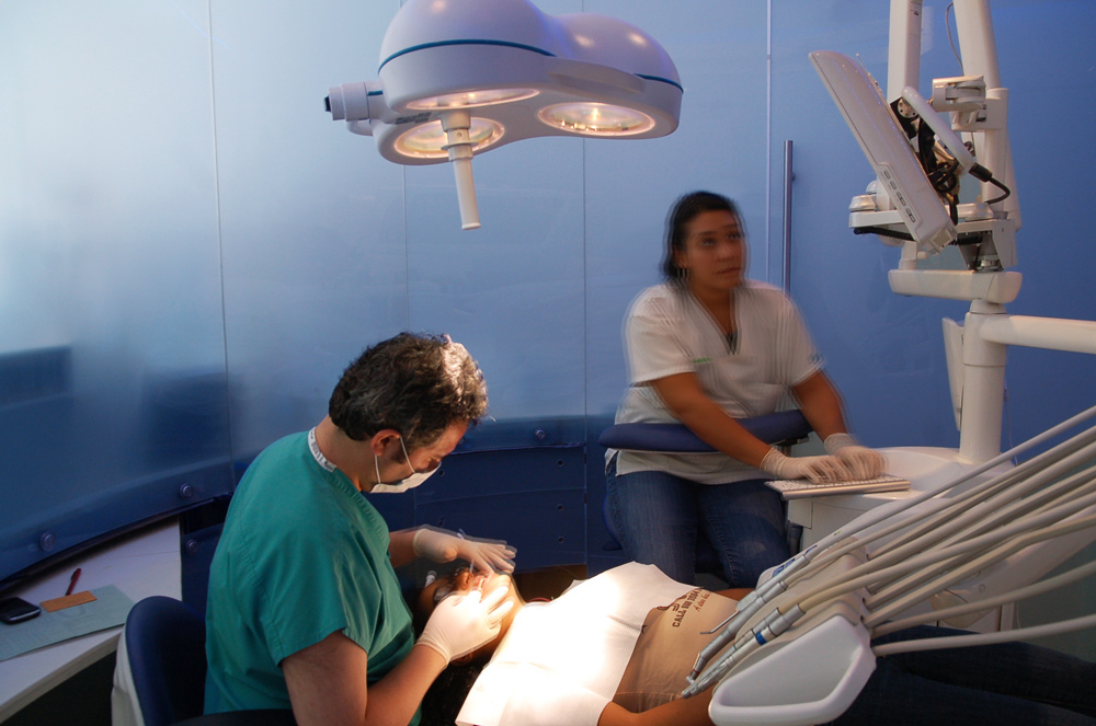
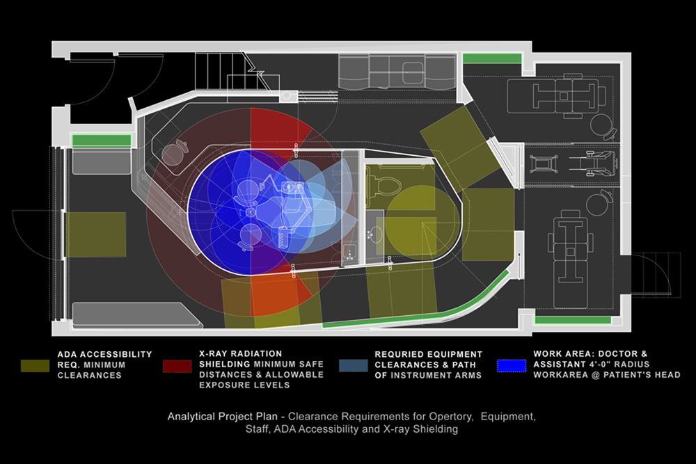
Upon receiving the basic program of what needed in the office, we immediately realized it would be extremely difficult to make everything fit into the allotted space. To develop a design that would meet our parameters, we worked with the doctor to analyze each of the procedures he would be performing and the specific equipment that would be needed. We then took each of these procedures and mapped out the movements and exact amount of space needed to do them.
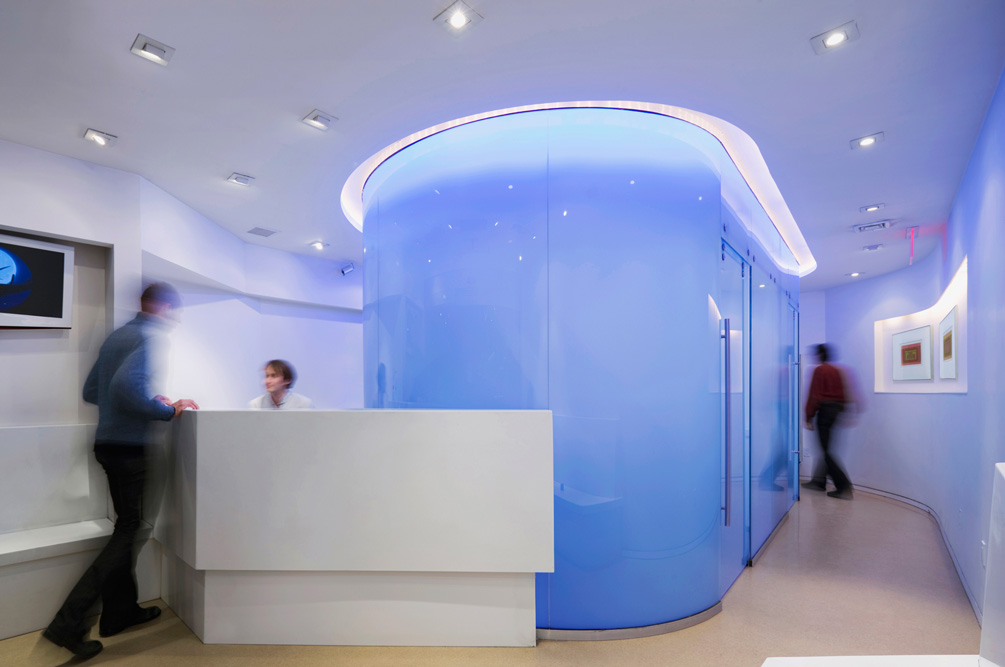
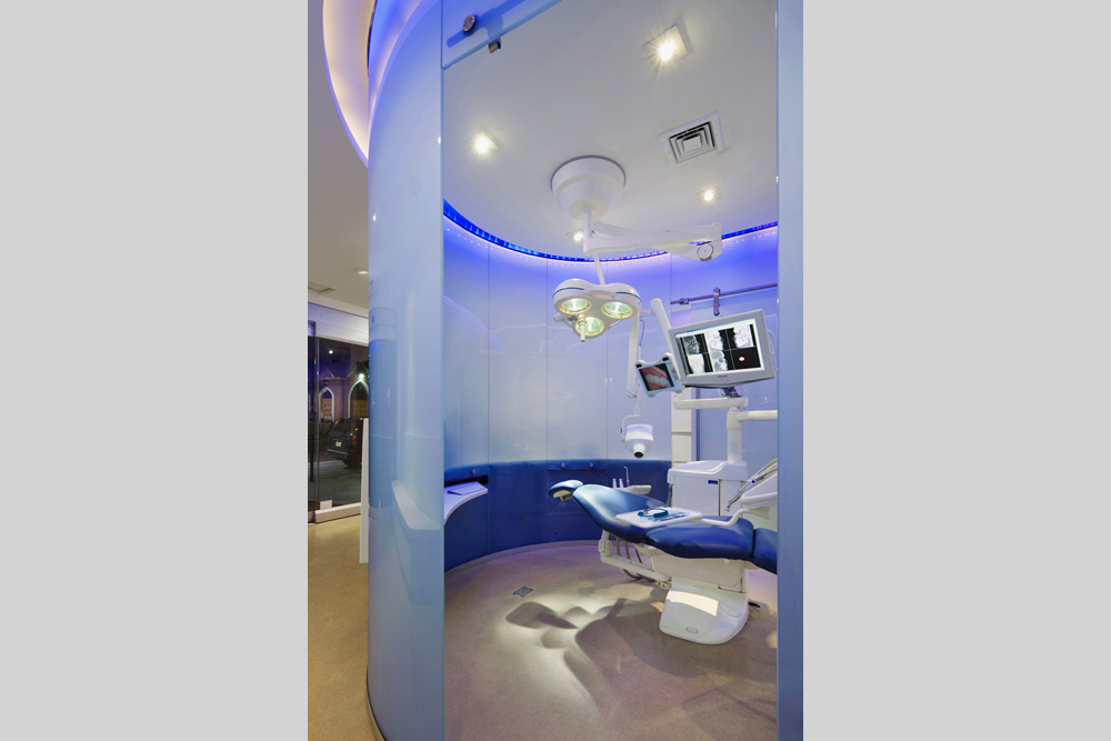
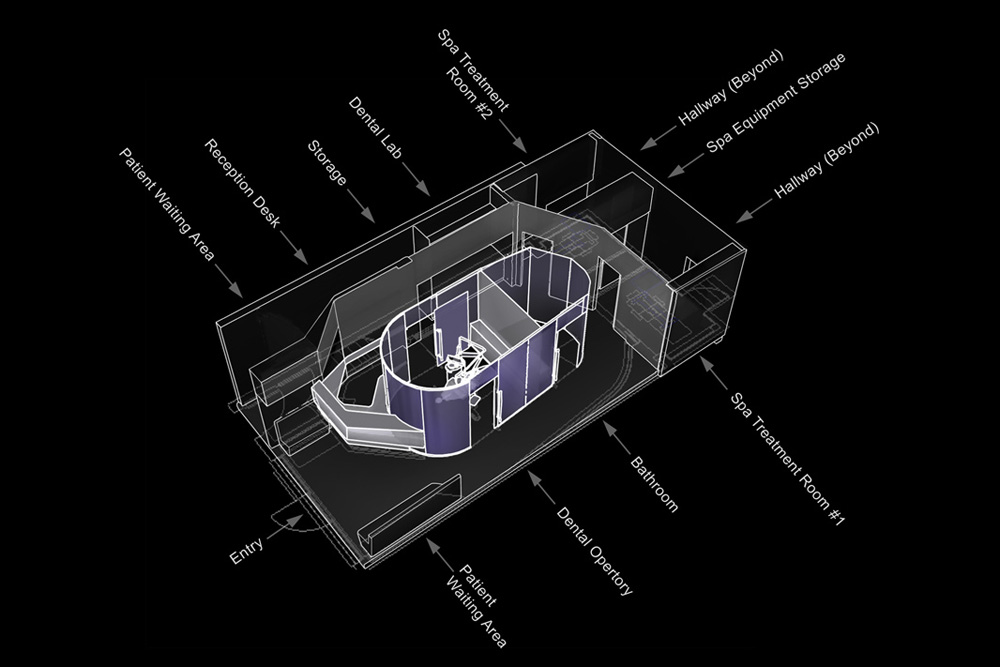
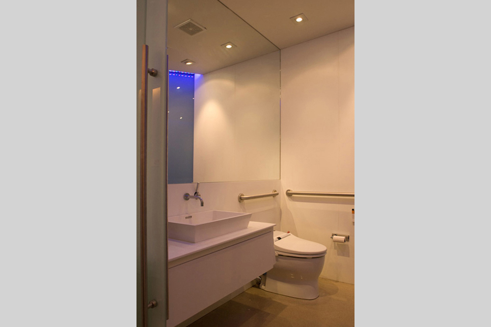
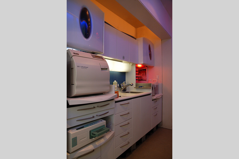
Based on this detailed information, we realized that the smallest shape and configuration of a dental operatory was not rectangular, but rather a trapezoidal shape with a semi-circle at one end. By literally “cutting corners” to create this unique shape, it allowed us to fit a reception desk, waiting room, ADA bathroom, sterilization unit, storage room, and cosmetic treatment room into the relatively small area we had to work with. Further investigation determined that we could further cut a corner from the ADA bathroom to save even more space (while complying with the legal requirements), allowing us to create a seamless egress path that wrapped around the operatory and bathroom, allowing all elements to fit and flow together.
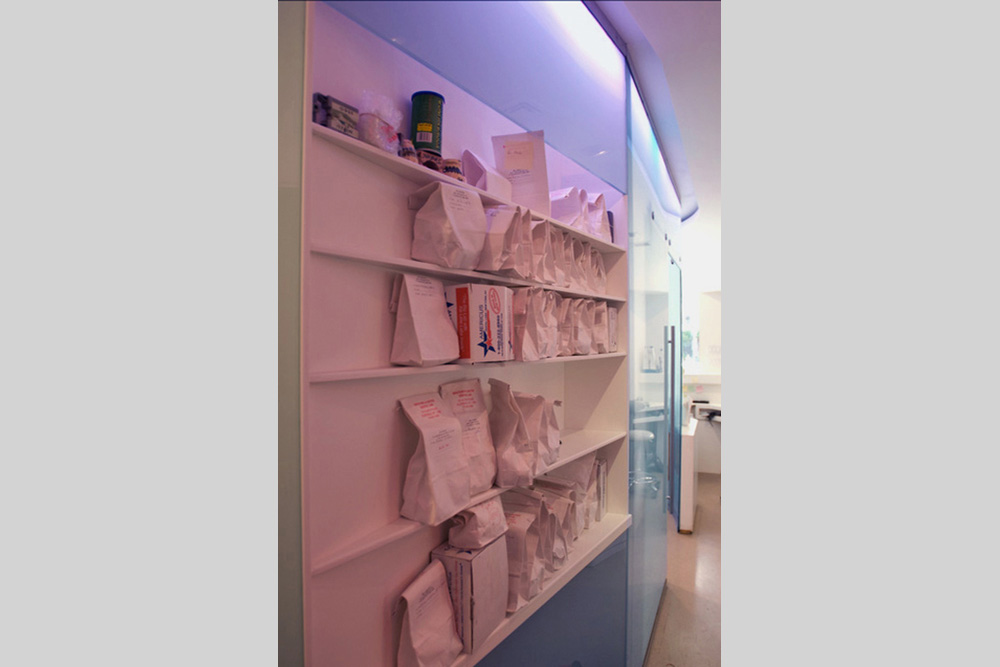
We then decided to make the curving operatory out of ½ frosted glass to maintain privacy while also knowing that this laminated glass would take up less space than a typical sheetrock wall. The frosted glass also provided an opportunity to illuminate the wall and create a striking, glowing form that would capture the attention of passers-by on the street, meeting our client’s goals.
The office was built for a third of what it might have cost otherwise, achieving the goal of building a striking dental-spa facility at a low cost. We accomplished this through creative design solutions and a “hybrid design-build” process where the doctor hired subcontractors directly (without a general contractor) while Soluri Architecture supervised their work.
The space was stripped down to the wood joists so we could level the floor, and everything was rebuilt to comply with current plumbing and electrical codes. We directly hired specialty fabricators to make the custom curved glass and the custom reception desk that was built with steel framing covered in solid surfacing to create a single, flowing, uniform shape.
During construction, the project began to arouse the curiosity of the neighbors and pedestrians as intended. People would stop in and inquire about the project, eagerly awaiting its completion so they could become patients. Upon completion, the project was so successful that the doctor gained thousands of new clients after several years, and soon retained Soluri Architecture to design a second, larger dental facility in another storefront down the block, which became Sensident: Form & Function.